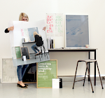
The book and the posters inside the folds. The feel of the uncoated stock gives it a sense of luxury the with the bad craftsmanship this felling is slightly destroyed.
Showing posts with label Design Context Book. Show all posts
Thursday, 3 June 2010
Spreads Inside the book
The book and the posters inside the folds. The feel of the uncoated stock gives it a sense of luxury the with the bad craftsmanship this felling is slightly destroyed.
Design Context Photo Shoot outcomes
I was overall happy with the outcome of the design for the context book yet I feel that the craft could have been a lot stronger. Yet the design sits with the posters well and keeps the look and feel consistent. I decided to have a fold at the beginning and the end of the book which ads more dimension to the book with a more playful feel it also gives the posters somewhere to sit.
Design Context Posters Outcome
The posters outcome where tested a couple of times, I firstly printed on a heavier stock and then printed onto a thiner stock as it folded better as i changed the idea to fit into the back of the book. I then decided to change the fold to sit into the book. As I printed the posters down the road as Vernon street the outcome was not good quality as the printers downstairs the printer was not calibrated correctly and the in design document I created the design in was put into a photoshop document which avoided all my considerations of point sizes, it also meant the craft was very poor yet i still felt that the design was much stronger on a thiner stock. I was happy with the design of the posters yet I was not happy with the crafting finish this is something I will put in my evaluation.
Wednesday, 2 June 2010
Poster tests Heavy stock
This was how the posters sit together yet I think that the stock is to thick and does not fold very well which craeses and gives an overall poor production apperance. Therefore I feel I should print on a lighter stock and change the design to not a full bleed of colour to just the type in colour so that it does not saturate the stock as much.
Layout book mock up test
This was a mock up test of my book testing the format and how different the layout testing scale of typefaces with hiarcy. I wanted to keep the book simple as this is the focus within the concept of the book yet keep the design consistent with the posters which are going to be packaged with the book.
Friday, 28 May 2010
Interview with Wim Crouwel and MC Place
Striking The Eye: An Interview With Wim Crouwel
Posted by Patrick Burgoyne, 10 July 2007, 14:08 Permalink Comments (6)
Dutch designer Wim Crouwel's New Alphabet type was devised with no curves or diagonal lines - in 1967
Throughout this month, we have been following the activities of design studio Build. On 28 June, Michael and Nicola Place, who make up Build, travelled to Dublin for a screening of Helvetica, followed by a panel discusssion and talk by Wim Crouwel. The following morning Build caught up with Crouwel to conduct this interview for CR
Friday 29 June 2007 09.40hrs; Wim Crouwel [WC], Michael Place [MCP] & Nicky Place [NJP]
We were in Dublin for Candy's SweetTalk 24 event , where Mr Crouwel had given an engaging, hour- long presentation – a potted history of his work and thinking – which was then followed by the Dublin screening of Helvetica – the film. The inevitable bar-stint followed [not with Mr Crouwel, we might add, who quite sensibly and quietly went back to his hotel] so when we turned up late for our meeting the next morning, well, it must have all seemed so predictable. In fact, we had turned up early for the meeting, just at the wrong hotel. So, we finally managed to catch up, 40 minutes late; we were extremely apologetic, he was extremely understanding...
MCP: Looking at your work, I always think it's so incredible; the form, the typefaces, the layout. It's very influential and yet we are seeing this out of context from the time it was created. At the time, did it seem shocking or was it accepted by those around as just good design, or were people quite indifferent?
WC: It was an amount of luck, we had the right clients who embraced this sort of thinking – mainly the director [of the Van Abbemuseum, and then of the Stedelijk Museum] who was a great and long term client. We met through my art school in Southern Holland [Groningen] where I was teaching in 1954 (up until then I was painting, i didn't really know what to do) – the head of the school knew the director – and six months after I had started teaching I got a phone call, which was the beginning of a long relationship with him. He wanted to represent artwork with a more advanced way of thinking that reflected what was happening with Modern Art. We were very interested in the abstract at that time. He was very supportive, as I dealt with him directly, and he dealt with the curators, who always wanted to have a say in the way their shows were promoted or represented. I just dealt with him, and he was very supportive of my ideas, as they fitted with the ideas of abstract paining, so my ideas were really quite accepted.
MCP: How did the public perceive your work?
WC: Well, the general public, I don't really know. But the interested public were very receptive to it. I was often invited to talk and the public that came to these talks were very accepting. In 1952 I had met a swiss designer whilst working for an exhibition design company in and between '52-'54 we worked together on large-scale projects encompassing art, architechture and design, our aim, to 'redefine the visual world'. From this came an institute which translates as 'The Foundation of Good Living', which produced a magazine promoting good interiors and therefore good living. It was a different direction for interiors, promoting a new, functional aesthetic, so even then there was a sense of promoting new thinking, new ways of looking at the world. In 1955 I met Kho Liang le who was an interior designer and we worked very well together, later setting up Designstudio.
MCP: You mentioned that luck has played a part in your success – that the director of the Stedelijk being a patron of what you did really helped to break the work to a wider audience and had you not met him that things could have been very different...
WC: Yes, he definitely understood the value of good design, that design should reflect the [new] thinking of the time. He had a law background but became director of art museums as an art lover; in 1954 he bought the first Picasso in Holland, for which people thought he was crazy. He went on to buy many more pieces and this is how he developed the collection of the Stedelijk.
MCP: You said in your presentation that the director would always critique your work but not until after it was done. Was his critique ever harsh?
WC: Oh, usually he would say something like, "that was not so inspired" or something like that. He was never too harsh. We had a long ongoing relationship like this.
MCP: When you became director [of the Boijmans van Beuningen Museum] you were then the client. Did you take anything from your time as designer for the Stedelijk that helped you in commissioning design for the museum?
WC: Oh, yes. I adopted many of the same techniques – of critiquing after and dealing with the curators on behalf of the designer. I had 15-20 years of experience working as a designer which I wanted to bring to my role as director. Sandberg, the director [of the Stedelijk], was a practising typographer and when we had meetings he always had a ruler and was drawing type. But when I became a director myself I found it was difficult to manage the responsibilities of director and be as involved in the design as I would have liked, so I hired two people to work with me. My brief to them was not "work with my grids" but rather "make the Institute visible" through a series of catalogues and posters for the museum. After a period of time we looked at the work as a set, and found that is was quite mismatched, it did not seem to have a single voice. So, I had to think how to address this. At around this time I had been approached by 8vo to write a piece on lower case typography for Octavo magazine. I knew that Hamish Muir andSimon Johnston had been taught by the Swiss typographer Wolfgang Weingart, and that they had taken this back to the UK and – with the other 8vo partners – had developed a new kind of language that had evolved away from this Swiss background; and that hadn't made it back to Switzerland or Holland – which I found very interesting. This is how I came to commission 8vo to work with me for the museum. I didn't want to impose my thinking but up to that point 8vo had mainly used Helvetica, whereas the museum's typeface was Futura, so this had to be a rule – as well as to have one size of cataloge and one of posters. That would mean everything had a consistency.
MCP: Do you think 8vo felt daunted working with you and on such a large undertaking?
WC: Well they didn't seem to be. They dealt with the curators themselves, each curator wants to make their own catalogue, so my only directive to the curators was to let the designers design.
MCP: Everyone seems to have a piece of Wim Crouwel work that that they love. For me it really is your typeface design – was that driven by a lack of expression in other available typefaces – or a reaction to the work/brief that became the seed for the new idea/design?
WC: We never designed a full typeface, only around the ten or so letters that were needed. I always searched for the abstract, something that would strike the eye.
I love sans serif typefaces. I love to work with Gill or Akzidenz Grotesk – both have an unevenness, which for many is fantastic. As Spiekermann says in the [Helvetica] film of Helvetica: "all the little things make it interesting..."
WC: We never designed a full typeface, only around the ten or so letters that were needed. I always searched for the abstract, something that would strike the eye.
I love sans serif typefaces. I love to work with Gill or Akzidenz Grotesk – both have an unevenness, which for many is fantastic. As Spiekermann says in the [Helvetica] film of Helvetica: "all the little things make it interesting..."
MCP: I'm a great believer in personal expression in graphic design and I believe that graphic design can ask questions as well as answer them. Do you see design as pure problem solving – or is that personal expression vital?
WC: Of course design is about problem solving, but I cannot resist adding something personal. A page should have tension.
MCP: Was there anything else that was influential to you in designing typefaces?
WC: I was, of course, very influenced by Joseph Müller-Brockmann. We met in 1957 and were friends since then. But Müller-Brockmann only every used Akzidenz Grotesk, never anything else, but he was a great inspiration.
MCP: Did you and JM-B ever critique each others work?
WC: No, I had far too much respect for him: He was ten years older than me, he was one of my heroes. I loved the abstract quality of his work – it was amazing. Müller-Brockmann was my man!
MCP: I came to your work quite late on, when I saw a version of New Alphabet on a Joy Division cover. Did you know about Peter Saville and that he had used that at the time?
WC: No, I had never met him at until we met in a chance meeting at the Mies Van der Rohe Pavilion in Barcelona.
MCP: How did you first see the Joy Division cover?
WC: In a magazine and on the internet. Somebody kindly took the letters and made them more legible, which of course wasn't the original idea! Eventually I worked withDavid Quay at The Foundry to make the New Alphabet a fully working typeface. He had approached me to see if i would be interested in working on it and because all the drawings existed for this it was possible. My father was a draughtsman and he had drawn up all the letters for me based on my sketches, so it was very possible to work on this to make it a full typeface. They [The Foundry] also worked to develop Gridnik, which started life as a commission for Olivetti typewriters. Myself, Joseph Müller-Brockmann and another designer were each commissioned to develop a typeface for the interchangeable balls for the typewriters, but in the end these were not used. So, I had had the drawings for Gridnik for 20 or 30 years, and David Quay developed it for release, as well as creating the missing letters and the different weights now available. I'm not a typeface designer, so I needed to work with someone to complete the typeface.
MCP: I am currently working on a typeface and when you design a whole alphabet you realise its such specialist skill...
NJP: Listening to your talk last night, I was thinking that of course when someone presents their work we see all the good parts, the cream of the work, and that naturally the stresses and difficult times disappear into the background or get lost in time. Has your experience really been the 'golden time' that it appears to be?
WC: Oh yes, it has been fantastic and it is as you see it. Although, in the beginning, designers used to be called 'Advertising Designers' who used to fight with everyone. But we designers all knew each other and wanted to lift design to a professional level, make it a profession in its own right. But we also realised we would never get very rich as a group; between the years 64-85 Total Design never really made much money, although we each had good salaries, but the business itself never made huge profits. In fact, one year, we made a loss. But we borrowed money from the financial directors who funded the studio and each year we paid them back, so the business was stable and we were able to have good salaries and pensions.
MCP: I started designing by doing record sleeve design – is that something you have thought about?
WC: I have never done any record sleeves...
MCP: You did one!
WC: Did I? Oh yes, for quite a strange project. Yes, a friend brought us together, me and the [music] artist – but music is not my business.
MCP: Record sleeves have always been a really exciting area of design, for me anyway, especially in the UK. Do you think design for music is important?
WC: Well, yes I do, music can be very inspiring, but design for music has never crossed my path, only where I have created theatre/ dance posters. Design for music is just not in my system....
WC: I have never done any record sleeves...
MCP: You did one!
WC: Did I? Oh yes, for quite a strange project. Yes, a friend brought us together, me and the [music] artist – but music is not my business.
MCP: Record sleeves have always been a really exciting area of design, for me anyway, especially in the UK. Do you think design for music is important?
WC: Well, yes I do, music can be very inspiring, but design for music has never crossed my path, only where I have created theatre/ dance posters. Design for music is just not in my system....
And then as hurriedly as we arrived, we had to leave. We thanked Mr Crouwel for so generously giving us his time, and suddenly we were off to the airport. Where, of course, we found our plane was delayed an hour and we could have continued talking for a good while longer. Isn't that called Murphy's law?
Tuesday, 25 May 2010
B&W Studio
B&W Studio
PROJECT: ANNUAL APPEAL 2007
DESIGNERS: LEE BRADLEY, STEVE WILLS, ANDREW DROOG AT B&W STUDIO
PHOTOGRAPHER: JOHN ANGERSON
CLIENT: ST. GEORGE'S CRYPT
PAPER FACTS:
STOCK MCNAUGHTON CYCLUS PRINT 115GSM
SIZE 210 X 148.5MM (8 1/4 X 5 13/16IN)
PRINT TECHNIQUES TWO-COLOR OFFSET LITHO
ADDITIONAL TECHNIQUE BADGE WITH LOGO APPLIED
PRINTER HARROGATE PRINT LTD.
PROJECT: ANNUAL APPEAL 2007
DESIGNERS: LEE BRADLEY, STEVE WILLS, ANDREW DROOG AT B&W STUDIO
PHOTOGRAPHER: JOHN ANGERSON
CLIENT: ST. GEORGE'S CRYPT
PAPER FACTS:
STOCK MCNAUGHTON CYCLUS PRINT 115GSM
SIZE 210 X 148.5MM (8 1/4 X 5 13/16IN)
PRINT TECHNIQUES TWO-COLOR OFFSET LITHO
ADDITIONAL TECHNIQUE BADGE WITH LOGO APPLIED
PRINTER HARROGATE PRINT LTD.
Charity St. George's Crypt's annual appeal is designed to raise money for the homeless. The 2007 brief to B&W Studio was to communicate how the money is spent and how the charity's clients benefit from the donations as well as updating donors on the previous year's activities. Direct messaging and the bold use of high-contrast yellow and black were chosen to ensure the piece would really stand out.
A recycled paper stock was chosen for its lightweight quality—a practical choice to help keep postage costs down. plastic mailing-bag houses four A3 (297 x 420mm; 11 3/4 x 16 1/5in) calendar posters, one for each season, folded to make a 16-page loose-leaf brochure. The final touch—a free badge bearing the charity's logo—gives the overall feel of a mailer with added extras.
Interview with sagmeister
Interview with Stefan Sagmeister, by Emily Winifred Ford, May 2008
Stefan Sagmeister has pushed the boundaries of typography with his deeply personal and often hand-made graphic designs. From his office in New York, Sagmeister recently published a book made up of 15 booklets, collectively entitled Things I Have Learned In My Life So Far. Each booklet contains a maxim, delicately composed using media ranging from sugar to microscopic pollen, and stories about how the images were produced. To keep himself fresh, he periodically closes his practice to clients for a full year to dedicate himself to experimentation.
FORD: Your work is uniquely personal—you once scratched a lecture poster into your chest with a razor. Where does that desire come from?
SAGMEISTER: As a designer it's our job to communicate. I find that so much of communication falls into an old version of modernism: informed by machines, very exact, and ultimately cold. Although that kind of communication worked very well in the 20s and 30s when it was new—we've had it now 80 years, at least 40 of which it was the status quo—modernism now leaves a vast percentage of the audience pretty cold. So to bring in a personal point of view or even subjectivity seems to me like a pretty obvious strategy. I am not arguing that every piece of communication should be designed from a personal point of view, but even the type of communication that seems the least conducive to personal communication would work much better were it not done in the standard modernism mode.
For example, I collect emergency exit cards from airplanes—I have hundreds of them. With one single exception, Virgin, they are designed in the same style: some sort of modernist icons with arrows that show you how to find the exit. I am on planes a lot, yet I have never seen a passenger looking at these cards, despite the stewardesses always reminding passengers to do so. Virgin, as far as I know, is the only airline anywhere that designed these cards with a much more personal, more cartoonish, and subjective point of view. Whenever I fly Virgin, I see people looking at the emergency cards. The same is true of the instructional videos. People actually watch the emergency movie because it's done quite beautifully. They are done with some love and care not only with regard to the content but also to the form. I think that sort of strategy could be even truer when your content is more personable, such as for a charity or a cultural event.
FORD: Have the emergency cards ever come to influence your work?
SAGMEISTER: I hope not! That sort of generic piece of design has been used to death in the last century. I'll die happily if I don't have to see another take on the emergency card; that sort of visual vocabulary has pretty much been beaten to death by now.
FORD: Has a client ever asked you to design in the typical modern style? How did you change the situation?
SAGMEISTER: I think it has probably happened but I've forgotten. Because we never had a recognizable style I think we quite successfully avoided being pigeonholed by clients. I know that other designers complain that clients say, "Oh, I want another one of these," but we have very little of that. I think it helped that, for a long while, we were all over the place stylistically and formally. The profession that complains about this the most, perhaps, is illustrators. Once an illustrator has an established style clients want it over and over again even if the illustrator is completely sick of it. There are a couple of illustrators, my friend Christoph Niemann for example, who almost from the very beginning established three and then five or seven styles, and successfully avoided the whole problem. I think something similar happened with our studio.
FORD: Your approach to experimenting is different from most design houses, which take an hour at the end of the day for experimentation. To have a whole year is very different.
SAGMEISTER: I think ultimately its very similar. If you're a designer desiring experimentation, you will have to institutionalize it. If you don't, you won't experiment because jobs with deadlines will always take precedence. Whether it is an hour every day, or a week every month, or a year every seven years, I think ultimately that's just a matter of timing.
FORD: What are your plans for your upcoming experiment year?
SAGMEISTER: I have a long list, which I wrote down in the last year or two, which needs to be ordered by importance and assigned weekly hours. I found that if I don't make a plan, others will make it for me. In my previous client-free year, my initial intent of just seeing what comes didn't work at all because my time was filled up with students from Korea asking questions or a Japanese design magazine wanting files to be sent, etc.
Although I am ordinarily not a secretive person, I have taken on the very Viennese habit of not talking about things that I have yet to do. Otherwise I live through it and loose the desire to actually do it. So, before I don't do the content of the upcoming year, I'd rather not talk about it.
FORD: What was your favorite project during your previous experimental year?
SAGMEISTER: The most enjoyable was designing a CD cover every Thursday from 9am to 12pm. I would put any CD that was lying around into the player, start working immediately, and then be done with the whole thing, complete with soft-page booklet and CD label by 12 o'clock.
FORD: How did the time constraint in the CD cover inform the design?
SAGMEISTER: I think constraints are good in general. Limited freedom is a very difficult place to work in. Brian Eno, who now is a client, once said the electric guitar became the predominant instrument of the 20th century exactly because it is such a "stupid" instrument, because it can do fairly little. The synthesizer, in contrast, never quite took that dominant place because the things it can do are too vast. And I think that, within that same realm, as a designer, you can take on various constraints. One of the constraints I took on in that year was time constraints. Designing a CD cover within three hours utterly changed the nature of the outcome. I had to work with existing materials. You don't have the luxury, the possibility, or the difficulty to say, "Okay this would work really great if had this computer program or that material right now." You have to make it work with the stuff you have. Of course this significantly changes the outcome not only in form but also conceptually since there was little time to conceptualize the whole thing. So the CD covers took in, and were informed by, my own little anxieties and inabilities. Because the process is so immediate—ideas need to take shape right then—I find that the results are automatically more personal pieces as a result. I think in the experimental year specifically, because it was an artificial time constraint—the outcome didn't need to be printable—it was very exciting to work this way.
FORD: Did the CD covers get better as time went on?
SAGMEISTER: No, they just became different. I think they went up and down. Some of them were wonderful some of them weren't.
FORD: When do you use time constraints in your everyday work?
SAGMEISTER: When it comes to idea generation I find it particularly helpful to have little pockets of designated time when you say, "I'm going to think about this now for 15 minutes." And in those 15 minutes you're truly thinking about it rather than going to the loo or checking email or doing something else.
When I returned to my regular studio mode following the experimental year, I tried using constraints again for regular client work. For example, in designing the billboard "Trying To Look Good Limits My Life" for Paris I used this same technique. We said, "Okay, let's take five days. We'll have one day for every billboard. We'll start at sunrise and we will have to be done at sundown because we don't have any flash equipment." This significantly changed the outcome both in concept and in form.
FORD: Design can be called a process of compromising to constraints. Is there anything you have compromised in your design?
SAGMEISTER: Oh, yup, all the time. It happens to us too. It's part of the deal. Whenever you involve others there has to be some give and take. If you want it to be your way 24 hours a day, then you are going to have to make it yourself and publish it yourself. As soon as you need collaborators—in our case [we have collaborators] for ideas as well as for execution and distribution, media choices—even then there will be compromises. These compromises can be seen as limitations or compromising can be seen as one of the more important abilities for any designer. I have always had the biggest admiration for people who can do good pieces for a very large audience; for example Olafur Eliasson I respect highly. I understand the difficulties that are involved in doing something good that also has to engage a large audience at, say, the Tate Modern, where over a million people will see it. Matt Groening from the Simpsons is also one of my favorite examples, or Saarinen and the Arch of St. Louis—things that become part of mass culture but are by themselves very high quality pieces.
FORD: Have you tackled these larger audiences?
SAGMEISTER: Not properly. I've always been too chicken shit to take on that scale.
FORD: Was your new book, the collection of maxims Things I Have Learned In My Life So Far, seeded from your experimental year as well?
SAGMEISTER: In a very loose way. All of the work in the book was produced after the year, when we were in regular studio mode again. But the thinking behind it as well as the list of maxims that I had quickly jotted down came from the year.
About a month into the experimental year, I thought I wanted to do film. I was not naive—becoming fluent in video starting from scratch was going to be a 10 year process. As I started to plan out how I was going to make this do-able, it occurred to me that design is a language just as valued as film; that maybe I should figure out if I had anything to say in the design-y language before I put ten years of my life learning video only to discover I have nothing to say. Up until that point, most of the things—although not exclusively—that I have said in the language of design were for promotional avenues. I thought there might be room for something that is more personal.
When the year was over and we did regular client work again, I was excited to take on clients that gave us a lot of freedom. I thought, "Maybe now's the time to really try out [developing a maxim for the client]." I don't have anything against selling and creating promotional things; I don't think selling and promoting is inherently bad, not at all, but there was room for something more personal. Although none of it was produced in that year, [many maxims were created in the following years for clients in the form of billboards, magazine covers and the like] I think the entire series basically came out of thinking during the experimental year.
FORD: Is there something in addition to the literal meaning of the maxims that you were trying to communicate?
SAGMEISTER: In many of them we pursued a strategy for the form that did not necessary come out of the saying itself. I thought that otherwise I might create a very one-dimensional saying that people would have difficulty finding themselves in. Instead, I created forms for many of them that have meaning to me but are opaque to an outside viewer. For example "Everything I Do Always Comes Back to Me" is made of onion rings which is a reference to my mentor Tibor Kalman's onion ring collection. The regular viewer somewhere in Korea or France wouldn't know that of course. But, because the saying itself is so straight forward, without irony, the more opaque form opens up the possibility for interpretation for the viewer. I felt that that was going to happen and I found evidence that this in fact did happen with a number of pieces
FORD: Do you think you are trying to have a conversation or a broadcast with your audience?
SAGMEISTER: In general the project is probably both. If you publish a book it's difficult to have a good dialogue, even with the feedback that people take time to write to me. But we do have a web version of the whole thing.
FORD: How do the book and the web site relate to each other?
SAGMEISTER: Well, the physical book is all designed by us while the webpage is designed by the general public, so the authors of the two are different but the subject is the same
FORD: Why did you want to do the web component?
SAGMEISTER: I don't know, sounds pretty obvious, no? Of course the technology enables us to do this efficiently and affordably. After I would give a talk there were audience members who asked after the possibility of a web site. In fact, at least three people offered to design the web site for us. I didn't take them up on the offer—we've had less than fantastic experiences with others designing web sites for us. But we definitely said we'd design a system for the site where the public can upload its own maxims, complete with image. And the two fit wonderfully together.
FORD: Are you becoming more interested in interactive or metamorphosing pieces as opposed to static pieces?
SAGMEISTER: I think I'll stay somewhere in between. Because of my age, even if there is a web component, I still like having a physical part. So my guess would be that we're moving into some sort of hybrid. It doesn't mean that a screen needs to be involved necessarily [as in the decaying banana typography for the Deitch gallery.] But, of course, like everybody else we would like to take advantage of new technologies.
FORD: What did you learn from producing the book?
SAGMEISTER: One of the biggest surprises to me was that halfway through we started to get clients that absolutely wanted a maxim. They would never have come to us for a logo or a web site. It underlined something that I suspected, but didn't quite dare to believe. Basically the reason commercial clients insist on doing all this selling and promotion work is because this has become the only option in the industry. If you give them an alternative, show that there are other possibilities, there are a good number of clients that will want to go down that road, even if they wouldn't even imagine going that route initially.
FORD: Have you convinced other commercial clients to do something other than promoting and selling?
SAGMEISTER: It's basically the Things I've learned In My Life So Far. I don't think we went outside that because, essentially, the studio has only been running for six or seven years since the last experimental year. Basically when we had a chance to do anything outside of the promotional arena we did one of the sentences.
FORD: What other things have you done that are outside the scopeof selling and promoting?
SAGMEISTER: Roughly a quarter of our work is for social causes and NGOs. This is, in a way, selling or promoting a cause, or informing people—the line between information and promotion is sometimes fairly blurry. Of course we pick the NGOs or the causes that are close to our hearts.
FORD: What's new in your social work?
SAGMEISTER: We're just towards the end of a small project for a rain forest in Panama. It's a very small organization that wants to save a particular, manageable part of the rainforest there. We took it on because their project, program, and business model all seem do-able; the chances seemed good that, after a year or two of engagement, they would actually raise the money, buy the rainforest, and make an eco path. Two of our most time-consuming NGOs that we work for [True Majority and OneVoice] have extremely big goals. Now, considering who may become president in November, True Majority might actually attain its goal [of decreasing the Pentagon budget and increasing the budget for education]. But if the other candidate is elected then the chances are nill for another four years. The second charity, One Voice, which we have been working with for the last five years, is an Israeli/Palestine organization against a gigantic goal that I don't think we are going to reach in any time soon. So, we had a desire to mix it up, to have some large NGOs and then a smaller one.
FORD: What role would you like designers to have in shaping our future socially?
SAGMEISTER: I think that's a question every designer will need to answer. I definitely don't think I could, or should, be a role model—I can't say this is what the profession should or should not be doing. For my own studio, I find it more satisfying and efficient when we mix it up, do community work mixed in with other work. I think in general design is too powerful a language to be used only for selling and promoting.
FORD: How did you come to know that you liked working in a small team?
SAGMEISTER: After design school I worked for companies that were small, medium, large, and even extra large. I found even at the very large companies, the good pieces came out of tiny teams of three or four people. Tthe largeness in most cases actually hindered the quality rather than supported it. The reason some design companies grew in size had nothing to do with the quality that they could deliver or even the quality that they can communicate to the audience or client. Rather it had much more to do with financial interests.
FORD: Do you think design should always be done in a small team?
SAGMEISTER: Within the world of communication, yes, absolutely. If you have three entities in that equation, an audience, the client, and a studio, all three are better off if the studio is small. There are some things within the applied arts that you can't really do well in a small team. Car design for example. But even there, now small teams seem to do extraordinary things, as we've seen with Tesla, the electric sports car. It's mind-boggling that a couple of guys in California can create a more efficient engine than general motors can design. While certain things need a large team, communications is not one of them.
FORD: Future work?
SAGMEISTER: As I mentioned I don't really don't like to talk about things I haven't completed yet, but let me just check what is on the burner that I am looking forward to seeing done. We're doing another sentence for Amsterdam involving lots of money that is lying around on the ground. It's a bit of an urban experiment to see if people will take the money even when it is beautifully arranged on the ground.
Another project that I am very much looking forward to is a design visualization guide for scientists. In many areas of science the scientists or their graduate students visualize very complex situations—the most complex things that one could possibly try to visualize—without any kind of education or training in that direction. So we've worked on a little guide, almost like a Design 101 handbook, but geared specifically for scientists.
FORD: Favorite tool with which to design?
SAGMEISTER: Oh my god! That is a difficult question … I have to think about it. The first things that comes to mind would be a pencil but that doesn't seem like a very interesting answer.
FORD: And your favorite time of day?
SAGMEISTER: The early morning.
Made Thought Interview
MadeThought / Typographic Circle. Taking the rough with the smooth off the grid
Published on Friday, 3 April, 2009 | 3:16 pm
‘New designers come to work with us and I see them spending half a day fannying around with the baseline grid,’ said MadeThought’s Paul Austin to a slightly alarmed audience at the Typographic Circle on Thursday night, writes Simon Esterson. ‘I don’t know what that is,’ he added and made it clear he didn’t really care either. ‘We don’t really have grids. We work . . . by eye.’ Keen to distance their approach from rigid design systems and emphasise that they want to ‘add a layer of expression’ to their projects, Austin opened a box of delights for their sell-out lecture at JWT in Knightsbridge. Ben Parker, MadeThought’s co-founder was often referred to but never seen.
The studio’s type decisions are immaculate, but most of the jobs are conceived to escape from the limitations of two-dimensional flat print: surfaces are duplexed, scored, perforated, folded, foiled, laser-etched or blind embossed and in one project for Addidas, holes are punched through covers and internal pages to reveal photographs below. Many of the recent projects are pieces of three-dimensional packaging design for Stella McCartney or Alan Yau’s Yauatcha, exhibitions or even, in the case of the façade of the new Reiss HQ off London’s Oxford Street, architecture. Here, MadeThought have covered the building’s facade with a pattern milled out of 80mm perspex.
Part of the studio’s aesthetic is about contrast: grey millboard invitations have gold foil edges, white surfaces open to reveal flourescent inners. The super-smooth of designer furniture brands like Established and Sons is tempered by raw surfaces. That’s the way we’ve liked our luxury recently: the rough with the smooth, the trainers with the tailored jacket.
I came out of JWT into G20-locked-down London . . . I wonder how things are going to be now that we have to take the rough with the rough?
Subscribe to:
Posts (Atom)