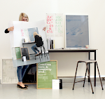
MadeThought / Typographic Circle. Taking the rough with the smooth off the grid
‘New designers come to work with us and I see them spending half a day fannying around with the baseline grid,’ said MadeThought’s Paul Austin to a slightly alarmed audience at the Typographic Circle on Thursday night, writes Simon Esterson. ‘I don’t know what that is,’ he added and made it clear he didn’t really care either. ‘We don’t really have grids. We work . . . by eye.’ Keen to distance their approach from rigid design systems and emphasise that they want to ‘add a layer of expression’ to their projects, Austin opened a box of delights for their sell-out lecture at JWT in Knightsbridge. Ben Parker, MadeThought’s co-founder was often referred to but never seen.
The studio’s type decisions are immaculate, but most of the jobs are conceived to escape from the limitations of two-dimensional flat print: surfaces are duplexed, scored, perforated, folded, foiled, laser-etched or blind embossed and in one project for Addidas, holes are punched through covers and internal pages to reveal photographs below. Many of the recent projects are pieces of three-dimensional packaging design for Stella McCartney or Alan Yau’s Yauatcha, exhibitions or even, in the case of the façade of the new Reiss HQ off London’s Oxford Street, architecture. Here, MadeThought have covered the building’s facade with a pattern milled out of 80mm perspex.
Part of the studio’s aesthetic is about contrast: grey millboard invitations have gold foil edges, white surfaces open to reveal flourescent inners. The super-smooth of designer furniture brands like Established and Sons is tempered by raw surfaces. That’s the way we’ve liked our luxury recently: the rough with the smooth, the trainers with the tailored jacket.
I came out of JWT into G20-locked-down London . . . I wonder how things are going to be now that we have to take the rough with the rough?


No comments:
Post a Comment