Showing posts with label editorial layout. Show all posts

Thursday, 3 June 2010

Spreads Inside the book


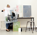
The book and the posters inside the folds. The feel of the uncoated stock gives it a sense of luxury the with the bad craftsmanship this felling is slightly destroyed.
Design Context Photo Shoot outcomes


I was overall happy with the outcome of the design for the context book yet I feel that the craft could have been a lot stronger. Yet the design sits with the posters well and keeps the look and feel consistent. I decided to have a fold at the beginning and the end of the book which ads more dimension to the book with a more playful feel it also gives the posters somewhere to sit.

Wednesday, 2 June 2010

Wim Crowel


The Netherlands, Groningen, 1928

linked with Paul Rand, Max Huber
“It was actually quite difficult to avoid Wim Crouwel’s work. In the 1960s the Netherlands was inundated with posters, catalogues, stamps designed by him, even the telephone book.”
- Karel Martens

This excerpt is from IDEA magazine #323, a feature issue about Crouwel and his work.

Wim Crouwel : architectures typographiques 1956-1976 An exhibition that ran from February 10th to April 28th, 2007, at Galerie Anatome in Paris. Catalogue and invitation designed by Experimental Jetset.

Wim Crouwel, born in Groningen (the Netherlands) in 1928 is a remarkable and inspiring figure with an inventive spirit and vision, vigorous and always distinguished.
He designed his first poster in 1952. After leaving artschool he became a painter leaning towards Expressionism, but as he designed this first poster he discovered the pleasure of organising visual information in an aesthetical context.
The contrast between Crouwel as a lyrical expressionist painter and objectivating functionalist designer couldn’t be more extreme. As a designer he felt related to the Bauhaus ideas, the swiss-inspired international style. He was fascinated by the rational aspect in Bauhaus typography, which he discovered through Karl Gerstner’s and Gerard Ifert’s work.
Although his ideas were bauhaus-related, unlike many Crouwel was not a dogmatist. He was fascinated by the ideas about serial and mass production, as he stated “we need the machine since we have no time”. But he also believed “the machine cannot replace the precision of the human eye and human feeling”.* Crouwel’s work has always consisted of these two essential elements: the emotional aspect and the rational one.

Vormgevers, 1968
poster, 95x64cm
Stedelijk Museum Amsterdam

The task of the designer consists of analysing the design project and solve the problems he distilled in an objective way. The message and the way it should be presented flows out of this process. Graphic design is a wide field in which Crouwel mainly focussed on type. He works quite constructive, constructs type, and works on grids. Crouwel is especially admired for his systematic approach and his creative handling of the shape of letters. His work was influenced by the pre-war Werkmann and post-war Sandberg, an individualistic generation of typographers who dared to juggle with letters.

CROUWEL AT THE VAN ABBE MUSEUM
In 1954 Crouwel designed the catalogues and posters for the Van Abbe Museum. He took the position that the design of a catalogue or poster must not be an interpretation of the artist’s ideas. It should merely provide relevant information to the reader, without ornaments or styling as this would only lead to confusion. The catalogue should not refer to the artist as an individual, but to the museum and its range of activities. The development of the programme as a whole is more important than creating the best poster ever for each new project.
Eduard de Wilde, Director of the Van Abbe Museum at the time Crouwel was asked for this task, remembers he found himself in an ambiguous situation. “Crouwels’s position of subjecting highly different appearances of art under the same typographic style would not be acceptable to some artists. But i also had to appreciate that transferring most different artistic trends and tem-peraments into typography might lead to a typographic chaos.” *

Leger, 1957
poster, 88x61cm
Stedelijk Van Abbemuseum Eindhoven

Beelden in het heden, 1960
poster, 95x64cm
Stedelijk Museum Amsterdam


MODERNIST, FUNCTIONALIST, PURIST
Crouwel is a modernist and impressed by a typeface like Helvetica, which was more neutral than any other typeface. “A face shouldn’t have a meaning in itself, the meaning should be in the content of the text.”* In his work Crouwel chose sans-serif faces that allowed numerous combinations, like Gill (Van Abbe museum) and Universe (Stedelijk). The essential information was set in one returning typeface and the title of the exhibition slightly reflected the feel of the exhibition. He looked at the work of the artist, got an impression and tried to translate it typographically. An example of this way of working is found in the exhibition about Leger. Leger’s work could be recognized by its heavy lines around the images. This influenced him to create the word Leger with thick black lines so it would dominate the poster. Crouwel always searched for the abstract, something that would strike the eye.

Licht/kunst, 1971
poster, 95x64cm
Stedelijk Museum Amsterdam

Het Nederlandse affiche 1890-1968, 1968
poster, 95x64cm
Museum Fodor Amsterdam

As a functionalist Crouwel focussed on the readability of his work. But when he had to make a choice between readability and aesthetics, he chose aesthetics. “When you're a functionalist you want to make things comprehensible, readable, make your ideas visible. I feel myself being a modernist, a functionalist, but aesthetics always stand in the way.” He says.*

Hussem en Bouthoom, 1961
poster
Stedelijk Van Abbemuseum Eindhoven

Morris Louis, 1965
poster
Stedelijk Museum Amsterdam

Couwel is a purist as he mainly uses type, but in the course of time non-typographic elements like lines and even reproductions would appear in his work. These slight changes of direction can be explained by his non-dogmatic view. Crouwel takes his customers’ wishes seriously and tries to match them with his own fundamental typographic principles. Often curators have their own opinion concerning the design for their exhibition. Crouwel’s carreer is marked by both his flexibility and his integrity.
TOTAL DESIGN
Together with colleagues Benno wissing, Friso Kramer and Dick & Paul Schwartz, Crouwel started a designstudio named Total Design. Total Design was to be the first bureau that managed to accept large and multidisciplinary designtasks for the government, as well as commercial clients.
In 1963 Eduard de Wilde succeeded Willem Sandberg as director of the Stedelijk in Amsterdam. Crouwel (and Total Design) moved along with him as he was asked to continue their cooperation. During the next twenty years he designed catalogues, invitations, posters and brochures and created what we now recall the SM-design style: a cool skillful, pragmatic artistry in the variation of normal and semi-bold grotesque letterfaces on a page at once fully exploited, yet open to all sides.*

Zeefdrukaffiches, 1966
poster
Stedelijk Museum Amsterdam 


NEW ALPHABET
Besides printwork Crouwel has designed several font sets, of which the New Alphabet (1967) is best known. This typefaces was developped after seeing the first digital typesetters at a print exhibition in Germany. The digital production of the Garamond, as presented on this exhibition looked horrible to him. The roundings of several sizes of a typeface were not alike, because of the small amount of pixels used, as you could see when the letters were enlarged.

New alphabet, an introduction for a programmed typography
hilversum, 1967
Wim Crouwel

The Quadrat Print in which Crouwel made his proposal for a new typeface more suitable than traditional type for the cathode-ray tube composing system.

Crouwel thought it would be better to design a typeface that was suitable for this machine instead of forcing it to use the typefaces we knew. He drew the New Alphabet, a highly abstract font, based on a dot-matrix system. With its straight lines, 90 degree angles and 45 degree roundings, either big or small, it always looked exactly the same. The face was as high as it was wide, thus lining in every way so it would fit in every grid system.
This typeface was merely developped as a theory, a direction of thinking. It wasn’t meant for actual use. Crouwel gave lectures on the subject and gained a lot of response. In the 90’s the New Alphabet showed up in UK pop magazines. Although it was often changed to make it more readable it was undoubtedly inspired by his original drawings. 30 years after his first experiment Crouwel was asked to digitise the original typeface.
Crouwel teached at diverse academies during the 70’s, before the computer period really started and was director of the Museum Boijmans Van Beuningen in Rotterdam In the years 1985-1993.

TODAY
Crouwel still is an active member of the Dutch graphic design scene as an advisor in Total Design. Today known as Total Identity it has more than 150 designers spread among 6 cities. You can find their recent work on http://www.totalidentity.com/

READING

Stankowski-Stiftung, Kunst+Design Wim Crouwel, Edition Cantz, Stuttgart (1991)

Frederike Huygen, Hugues Boekraad, Wim Crouwel: Mode en Module, 010 Publishers, Rotterdam (1997). find this book on amazon.com

Kees Broos, Wim Crouwel: Alphabets, BIS Publishers, Amsterdam (2003).
find this book on amazon.com

Catherine de Smet, Emmanuel Bérard, Wim Crouwel: Architectures Typographiques / Typographic Architectures, Editions F7, Parijs (2007).

IMAGES

flickrgroup from blanka.co.uk
flickrgroup from wimcrouwel/pool

INTERVIEW

étapes interview part 1 (youtube)
étapes interview part 2 (youtube)
creative review: Striking the eye; an interview with wim Crouwel

Grids swissmiss


Grids

Aaron Gustafson recently published an article on A List Apart in which he proposes some Javascript to wrestle images into place. The problem being that you, the designer, come up with a perfect flexible grid which requires images to conform to one of a number of pre-defined sizes. Except the ensuing content creators inevitably ignore these rules and upload images of sizes which suit them best (for whatever reason). Instead of forcing the CMS to resize the images, Aaron’s script calculates how the image should fit into your grid and retrospectively applies CSS classes accordingly. Clever stuff (even if it does require Prototype).
A week ago, Jon Hicks twittered thusly:
Hicksy wonders if someone clever with javascript can come up with a background grid thing, that can be toggled on/off via keyboard
Mere days later, Stephen Hallgren came up with Grid Layouts.com, a magnificently handy bit of code for toggling a grid on and off straight from the keyboard using ctrl+shift+g.
And so to the CSS 3 module CSS Grid Positioning which was recently released as a working draft. The official description:
An element with columns (as in Multi-column Layout) establishes an implicit grid. Together with optional explicit grid lines, that establishes a coordinate system for positioning floats and absolutely positioned boxes. This module proposes properties to position and size floating boxes relative to this grid.
Essentially the module will enable authors to define a grid and then position content elements with that grid, allowing for column spanning, and content flow around positioned elements. If/when it ever comes to fruition, this will be a fantastic addition to CSS, so much so that it might actually make it easier to create tightly gridded layouts on the Web than in conventional print layout software.

Tuesday, 25 May 2010

Interview for Jamie Deleney

Hi Jamie,

This may be a strange email or a very common one but I am a third year student at Leeds College of art. I am currently making a book about some of my favorite designers and their design, focusing on the clarity and function within layout. I would really appreciate it if you could spare a couple of minutes from your busy schedule and answer a few questions on your opinions on clarity and function within designing layout?

What do you feel helps aid clarity when designing for layout. 

What do you do to make this clarity, but to ensure the design is powerful and interesting

What do you feel helps layout design function best.

Thank you for your time to answer the questions I would love to send you a copy of my book when complete or if you would like to take a look at my website the address is www.rhiannewithers.com.

Once again thank you for your time and help  

Kind Regards
Rhianne Withers

Monday, 24 May 2010

Swiss design


lso known as International Style, the Swiss Style does not simply describe a style of graphic design made in Switzerland. It became famous through the art of very talented Swiss graphic designers, but it emerged in Russia, Germany and Netherlands in the 1920’s. This style in art, architecture and culture became an ‘international’ style after 1950’s and it was produced by artists all around the globe. Despite that, people still refer to it as the Swiss Style or the Swiss Legacy.
This progressive, radical movement in graphic design is not concerned with the graphic design in Switzerland, but rather with the new style that had been proposed, attacked and defended in the 1920s in Switzerland. Keen attention to detail, precision, craft skills, system of education and technical training, a high standard of printing as well as a clear refined and inventive lettering and typoraphy laid out a foundation for a new movement that has been exported worldwide in 1960s to become an international style.
Rr in Lessons From Swiss Style Graphic Design
Fiat in Lessons From Swiss Style Graphic Design
Emerging from the modernist and constructivist ideals, the Swiss Style can be defined as an authentic pursue for simplicity – the beauty in the underlines of a purpose, not beauty as a purpose in itself. The principle “form follows function” became a battle-cry of Modernist architects after the 1930s. As a consequence of this principle, most of the Swiss Style craft is devoted to the minimal elements of style such as typography and content layout rather than on textures and illustrations.

Sunday, 23 May 2010

Manchester tony brook and Shaughnessy’s talk thanks dandad


Tony Brook and Adrian Shaughnessy’s refreshing perspective on their love for classic format, under-the-radar graphics and their newest endeavour, publishing company Unit Editions.
D&AD’s education intern gives her tag-along perspective:
Before the Presidents’ Lecture, the pub next door is mostly empty. Brook and Shaughnessy sit at a table in the corner, in the midst of a clutch of students. Design mavericks at the top of their game, few are better qualified to share valuable knowledge of the industry.
Beginning a career in design is no mean feat, with more graduates leaving art schools in 2009 than ever before. Brook and Shaughnessy are dispatching some sage advice; Portfolio, application letters and interview techniques are all being covered in detail. Handy tidbits such as “avoid using a ring-bound portfolio, it’s what everyone uses, and shows a lack of imagination” and “always hand-write the address on your application letter, it’s more personal and harder for the receiver to ignore”, are being furiously jotted into sketchpads. I’m more interested to note that, in their opinion “…one of the most important jobs in the design studio is how you answer the phone.”
It is this no-nonsense, practical and social approach that makes this pair unique in their outlook on critical design. Keen to underline that they’re not academics, they believe in the need to bring design theory back down to earth. They’ve teamed up with Stockport College to share their experiences and inspirations; removing the pretence and jargon, which can so often alienate the subject’s new-comers.
The President’s Lecture at Manchester’s Print Works revolved around the pair’s enormous spectrum of influences and self-initiated projects. Their newest enterprise Unit Editions, is the love-child of a long-lasting courtship of all things Graphic Design. From inspiring theoretical texts, to the cluttered diversity of professional design studios and Folk-Modernists of the 1960s; they’re keen to share their interest in everything they feel has slipped beneath the Graphic Design radar.
Unit Editions is born out of a desire to marry impeccably art-directed style and visuals with substance to boot. Their latest endeavour, Unit: Design/Research, are a series of small publications that feature subjects in which they take a personal interest; indulging joys encountered in some of the over-looked corners of the design world.
But what on earth- you might reasonably ask- would possess you to start a publishing company at the height of a digital and technological revolution? When bookshops are closing and with content freely available online, is there a market for new design publications?
It’s the tactility and longevity that the traditional book provides, and Brook and Shaughnessy believe that it’s something that can’t be replaced: “The internet is an incredible resource, but it doesn’t have the permanence that a physical book does. Visual grazing online is too easily lost and forgotten in the haze of the digital Cloud. A book is always there, on your shelf or open on your desk… radiating inspiration.”
Success, they agree, is also dependent on harmonizing the business with the virtues of the Web. Unit Editions has a strong online presence, and they’re successfully utilising the internet’s non-capitalist philosophy. Their constantly updated Flikr stream bursts with content- photographs and detailed scans of the duos latest publications and inspiring discoveries. “We are living in something of a golden age,” they say, “Graphic design no longer requires a client.”
What Brook is keen to emphasise is the importance of self-initiated projects- telling the story of how his first motion graphic experiment resulted in winning an identity design job with Channel 4.
‘Take a risk’ is the message for the Industry’s young hopefuls. Unit Editions is the case in point of how a bit of passion and bravery can result in something great.

Kemistry Gallery 10 yeras of posters experimental jetset