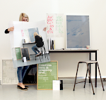


This was how the posters sit together yet I think that the stock is to thick and does not fold very well which craeses and gives an overall poor production apperance. Therefore I feel I should print on a lighter stock and change the design to not a full bleed of colour to just the type in colour so that it does not saturate the stock as much.


No comments:
Post a Comment