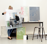


The posters outcome where tested a couple of times, I firstly printed on a heavier stock and then printed onto a thiner stock as it folded better as i changed the idea to fit into the back of the book. I then decided to change the fold to sit into the book. As I printed the posters down the road as Vernon street the outcome was not good quality as the printers downstairs the printer was not calibrated correctly and the in design document I created the design in was put into a photoshop document which avoided all my considerations of point sizes, it also meant the craft was very poor yet i still felt that the design was much stronger on a thiner stock. I was happy with the design of the posters yet I was not happy with the crafting finish this is something I will put in my evaluation.


No comments:
Post a Comment