GREIG ANDERSON of Effektive (www.effektivedesign.co.uk) is a 27-year-old graphic designer. Originally from Aberdeen, Scotland he graduated with a BA (Hons) Graphic Design degree in 2004 and has previously spent four years working within the Scottish/UK design industry at multi-disciplinary agency Curious based in Glasgow. Greig is currently based in Sydney for 12 months and is working as a designer at Surrey Hills-based design agency There.
WD: With the increasing use of online promotion, why did you choose to go down the offline route?
WD: With the increasing use of online promotion, why did you choose to go down the offline route?
WD: What design and/or production issues did you face?
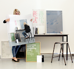
GA: The main design problem I faced was format. I knew that I wanted to make the piece predominantly about showcasing my work so that the recipient could quickly and easily just look at work samples if they didn’t want to read all the information. Generally I feel that most designers and agencies will make a judgement on you based on the work before anything else and really just want to see that before then going back to read more about you. I decided that I wanted to create a large-format poster again for physical impact so I thought originally about sending out posters in custom poster tubes but soon realised that that would be difficult and expensive to do well. I started looking at various ways that I could fold the poster down to a more manageable, mailable size and eventually went for an A2 flat poster which folds down to a A5 booklet. This gave me the impact of the poster and also a nice sequential booklet to introduce myself. The A5 size meant it was much easier to mail and the A5 plastic sealable bags were an offthe- shelf size which helped to keep the cost down. The only other problems faced once I had the format was actually sitting down and putting the design together and selecting the work I wanted to showcase, it’s true that you are your own worst client. I must have gone through ten versions of the design before I finally settled and that was only because I was running out of time! In terms of production I wanted them to be printed litho for quality and I chose to print them on Cyclus Offset for a nice off white newsprint feel. Luckily I had a contact at a printers which was happy to do me deal on the printing which helped keep the cost down. Obviously due to printing litho I had to get far more than I needed to make it worth switching the press on and so I ended up with 250 and around 50 were sent to selected Sydney-based agencies. I will be selling the remaining 200 or so when I return to the UK in the autumn on a new shop feature on my website.
WD: What key advice would you give to any designer/agency that was thinking of using a similar method of self promoting their skills/products?
GA: It would differ whether you are a designer sending to agencies or whether it is more of a new business/marketing tool aimed at potential clients but my advice would be to create something that represents you to the best of your ability and something that you, as a designer, would be excited to find sitting on your desk. I tried to create something that I thought was in itself a good example of my design skills as well as something which would introduce and promote me and my work.


No comments:
Post a Comment