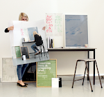

Irish Museum of Mordern Art (Museum 21 IMMA International Symposium).
Development of identity & promotional material. The purpous of the symposium was to address the role of gallery and museum space in the 21th century, this was reflected in the identity by picking out of the word ‘use’ within the ‘museum 21’ logo.
Development of identity & promotional material. The purpous of the symposium was to address the role of gallery and museum space in the 21th century, this was reflected in the identity by picking out of the word ‘use’ within the ‘museum 21’ logo.
1. Hiarcy
2. Colour
3. Typeface
4. Limitations
5. Concepts
6. Subtle consistency
7. Print process & production
8. The function of the overal print go.
2. Colour
3. Typeface
4. Limitations
5. Concepts
6. Subtle consistency
7. Print process & production
8. The function of the overal print go.
The use within the museum helps create the message of ‘use’ the promotion. Within the colour of the irish green it gives enough message to hint towards the event been in ireland. Without been to obvious about the message.
The typeface used has with a sans serfif that uncompletcates the message when the type is layed over each other. Some may argue about the hyphen within the layout yet this adds an intrest to the bold but simple design. The idea shows the designer as playful and daring but the layout is still visible and clear.
The most important element of clarity and function is what you take away in order for the design to be as clear as possible. The only visual guide used within the design are lines which help guide the reader through the publication. Yet the main focus is the message of teh event which is not over compliacted with unnessercery imagery.
The main concept within the publication is the element of the use within the word museum. The play on the language is an important part to the publication and is something I try to do within my work. the word use intrprutes the word useful. It instant reflect the purpose of the museum in teh 21st century which is the message the deigner wanted to portray. Which aids the event to be useful to the market. This aids the clarity once again yet without been distracting.
The subtle consitency within the publiaction is the use of the logo and the ‘use’ within the logo which is used consitently within the publication which is the subtle but powerful concept which helps aid the clarity but creativity within the publication. The colour of the vibrant green is kept consitent throughout
The print processes within the design is on a matt stock with the consitent use of a strong spot clour which aids the vibrancy of the design.
tbc print process
designers questions
outcome of the design clarity.


No comments:
Post a Comment