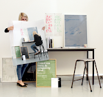
Malcolm Garrett
I figure it's my job to be this kind of blinkered believer, You know I am the new futurist, I will live in the technological world.
Malcolm Garret was born in Northwich, England in 1956. He studied typography at Reading University from 1974-75, and graphic design at Manchester Polytechnic from 1975-78. In 1977, he produced his first professional work and made an immediate impact with his designs for Manchester punk rock group Buzzcocks. In the late 1970s and early 1980s, Garret was rapidly identified. along with colleagues Peter Saville and Neville Brody, as one of the most influential designers working for youth culture clients such as the music business and style magazines. In 1983, with partner Kasper de Graaf, he incorporated the multidisciplinary consultancy Assorted images (Ai). In projects for Simple Minds, Duran Duran and Culture Club, Garret applied his ideas about corporate identity to pop groups. Other work in the entertainment industry followed, including television graphics. Ai was an early advocate of computer graphics and in the late 1980s Garrett's focus shifted decisively in the direction of new technology. He has experimented with interactive databases and digital magazines, and published a series of manifestos in the magazine Graphis World, Baseline and 26 in which he outlined his ideas about the implications of digital technology for the graphic design and the future of media.
Rick Poynor: For a long time you complained about typecasting, and from around the mid-1980s you said you wanted to do a broader range of work. Have you achieved this?
Malcolm Garret: I think so, yes, though it's still early days. I like the look of my work on screen and I sometimes get frustrated that it's got to come out and go on to paper. It's a combination of my fascination with technology plus boredom at having done print for paper for fifteen years.
RP: What about corporate projects - the identities you dreamed of doing at one point?
MG: They're beginning to happen on a smallish scale. I think I was just expressing a frustration with always working for pop groups or friends. One of our clients is The Computer Film Company, which does digital effects for the movie industry. A lot of our work is still linked to entertainment in some way. I still think there's a lot I could do that I haven't been asked to do yet. I'm not a very good career planner if left to my own devices. I tend just to react to things coming through the door: well. that's an interesting project, I'll do that. There are challenges, things I haven't done that I'd like to try. Doing another record sleeve is not really a challenge.
RP: But you are still doing record sleeves.
MG: I still work with Peter Gabriel and Real World. We've just done the packaging for his CD-ROM. I wish I'd been more involved with the actual programme, not just the package. I was involved at the beginning, trying to ensure the Real World identity was properly represented on screen, but for geographical and software reasons that's as far as it went. Even though earlier we had separately proposed doing just such a project with Real World, it was a full year before they started work on this one - with somebody else. We were too early. But that's also, I think, part of my problem. Sometimes I'm too early with my thinking and I seem to be unable to be around at the right time to do the job.
RP: You've expressed a lot of scepticism about the design profession's notions of 'quality'. Do you really believe that the visual qualities of a piece of work are irrelevant?
MG: It's not really a scepticism about quality. I'm as seduced by beauty as the next man, but I question what quality means. What I was trying to get designers to address was this 1980s notion of the 'designer' look - if you made it discreet and black then it was good design. Of course, the visual qualities of a piece of work are highly relevant, but they should not be presupposed. Good typography may well be just the scrawled price stuck on a piece of meat in a butcher's shop window. You know, it communicates: £ 1 a pound, I can read that, I'll go and buy it. That is good design in the sense that it communicated in a seamless way and the 'quality' of the letterform doing the job didn't actually come into it. not in a formal way.
I was trying to say that our sophisticated notions of aesthetic quality aren't necessarily the most important thing in a job. But I was also trying to qualify that by saying you can't make global judgements on quality because everything has to be judged within its own context. And I think that's something that Assorted images has always tried to express: who knows what the job I'm asked to do tomorrow will look like because I don't yet know the context, the message, or the medium. Those are so important in governing what something should look like. I was despairing about the kind of design where you say, oh Joe Bloggs did that, because you see his way of doing it before you see what it's about. I've always fought against that . . .
Subscribe to:
Post Comments (Atom)


No comments:
Post a Comment