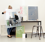
Design notes: the 2010 Fellowship Poster
Wednesday, 27 January 2010
- Dan Vlahos
An excerpt from my design brief:
Three potentially relevant themes come to mind: optimism, collaboration, and design. With a core message around design our firm is well positioned for continued growth and innovation. The current economic climate offers opportunities to work better, smarter, and maybe even faster. In December we announced our merger with the Phoenix-based Merzproject, a 2009 (Architectural Record) Design Vanguard firm. Our Phoenix office is now Merzproject, a studio of Shepley Bulfinch. This gesture has been seen as a symbol of growth, optimism and strength. This same optimism should be encapsulated in the Fellowship poster design. A few weeks ago our President Carole Wedge, gave every employee a copy of The Designful Company: How to Build a Culture of Nonstop Innovation by Marty Neumeier. Her message is clear: design should inform everything we do.
Three potentially relevant themes come to mind: optimism, collaboration, and design. With a core message around design our firm is well positioned for continued growth and innovation. The current economic climate offers opportunities to work better, smarter, and maybe even faster. In December we announced our merger with the Phoenix-based Merzproject, a 2009 (Architectural Record) Design Vanguard firm. Our Phoenix office is now Merzproject, a studio of Shepley Bulfinch. This gesture has been seen as a symbol of growth, optimism and strength. This same optimism should be encapsulated in the Fellowship poster design. A few weeks ago our President Carole Wedge, gave every employee a copy of The Designful Company: How to Build a Culture of Nonstop Innovation by Marty Neumeier. Her message is clear: design should inform everything we do.
Besides optimism and design, the third theme to consider is collaboration. With our tools, culture and technologies rapidly changing, our teams are expected to be increasingly collaborative or, in overused architectural buzz terms, “integrated”. This basically means we’re working faster, drawing in three dimensions, with more key decisions being made earlier in the design process.
As one of the oldest continuously practicing architecture firms in the world one thing we struggle with is how we consider our history. While our 135 year legacy provides stature, it also forces us to constantly innovate, lead, and reinvent.
An excerpt from Experimental Jetset:
As for the motivation behind the poster… Well, in our design, we referred to the three themes you mentioned in the design brief: optimism, collaboration and design. But we also referred to the “forbidden” theme: tradition. Let’s start with tradition. While making sketches for the poster, thinking about the year ‘2010′ and architecture, we suddenly had to think about Roman numerals. After all, there exists a sort of sub-tradition of using Roman numerals on buildings. We realized that ‘2010′, in Roman numerals, is quite an interesting number: MMX. It’s exceptionally short (a once-in-a-decade thing), and also very geometrical (as there are no C’s in it…)
As for the motivation behind the poster… Well, in our design, we referred to the three themes you mentioned in the design brief: optimism, collaboration and design. But we also referred to the “forbidden” theme: tradition. Let’s start with tradition. While making sketches for the poster, thinking about the year ‘2010′ and architecture, we suddenly had to think about Roman numerals. After all, there exists a sort of sub-tradition of using Roman numerals on buildings. We realized that ‘2010′, in Roman numerals, is quite an interesting number: MMX. It’s exceptionally short (a once-in-a-decade thing), and also very geometrical (as there are no C’s in it…)
So, starting with the idea of Roman numerals, we decided to turn the number MMX into geometric forms, in the primary colors: red, blue, yellow. Bright colours, referring to the optimism you mentioned. But the combination of primary colours and geometric forms also refer to design: colour theories, aesthetic systems, De Stijl, Bauhaus and other iconic design movements, etc. By overprinting the forms, secondary colours appear: orange, purple, green. To us, these overlaps refer to the idea of collaboration. So yeah, these are the three themes you talked about: optimism, design, collaboration. We are really happy with the result, we hope you are, too.
An early sketch:
The finished poster:


No comments:
Post a Comment