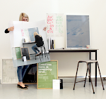


The layout of the brochure is unquie amd different in theory it dosent work yet it works very well your eye reads down the page yet thewhen your eye reads down the page you want to read more as it is arranged out of teh grid this strange grid in different coluns runs throughout the page contrasting with different paper stocks which is something to consider with the year book. The idea of this something i need to expolt more and test aand ppush boundaries with i need to more risky and playfyl within my layout.


No comments:
Post a Comment