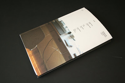


I was overall happy with the outcome of the design for the context book yet I feel that the craft could have been a lot stronger. Yet the design sits with the posters well and keeps the look and feel consistent. I decided to have a fold at the beginning and the end of the book which ads more dimension to the book with a more playful feel it also gives the posters somewhere to sit.


No comments:
Post a Comment